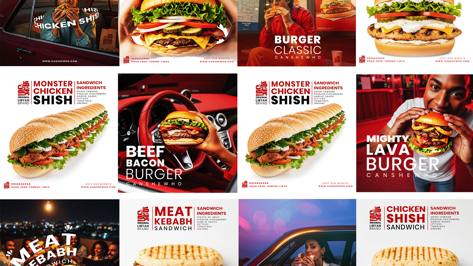
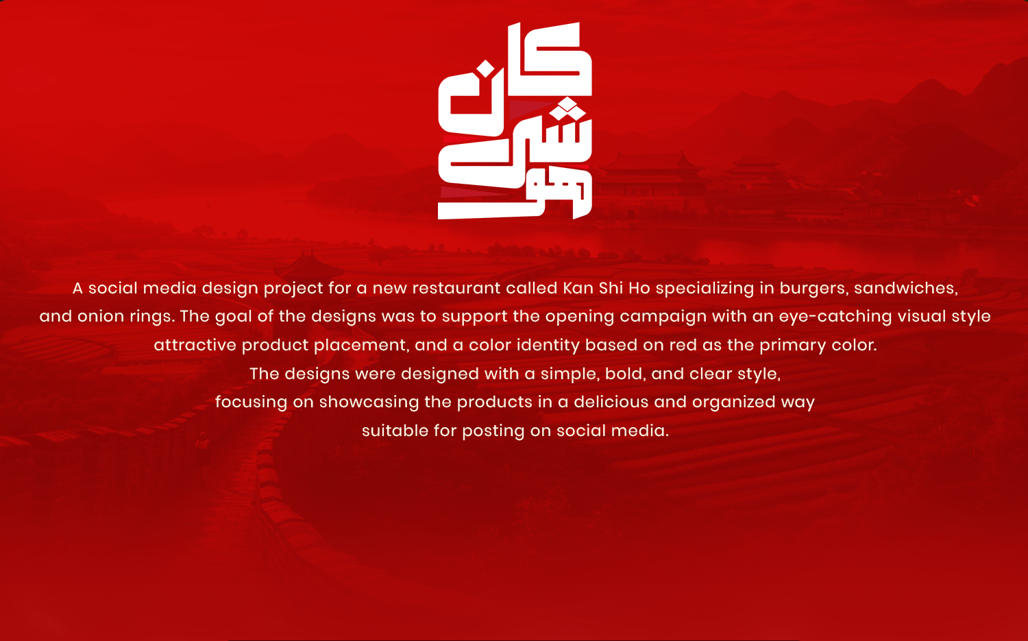
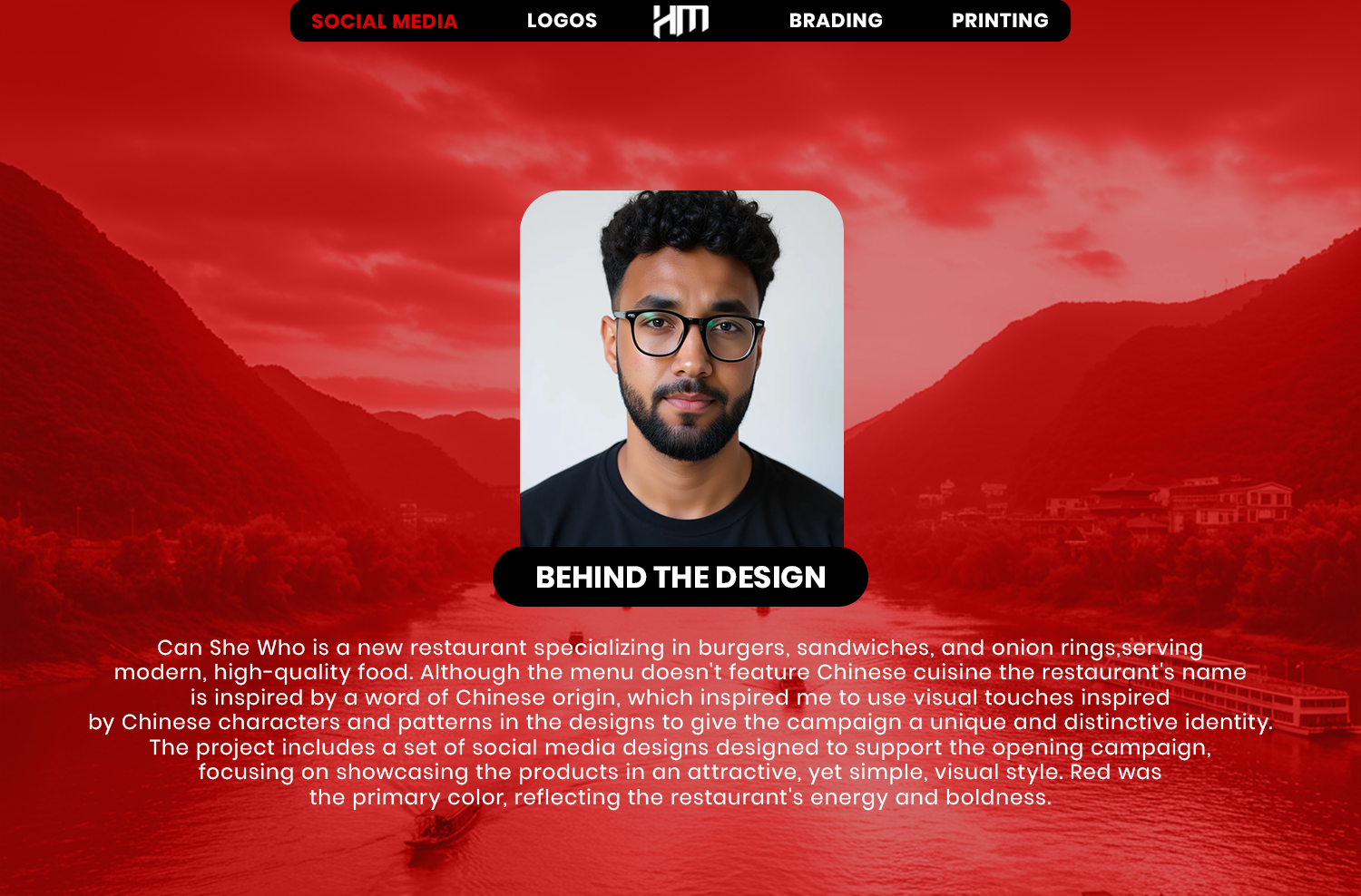


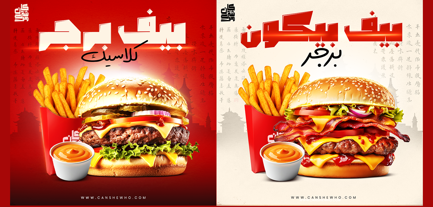
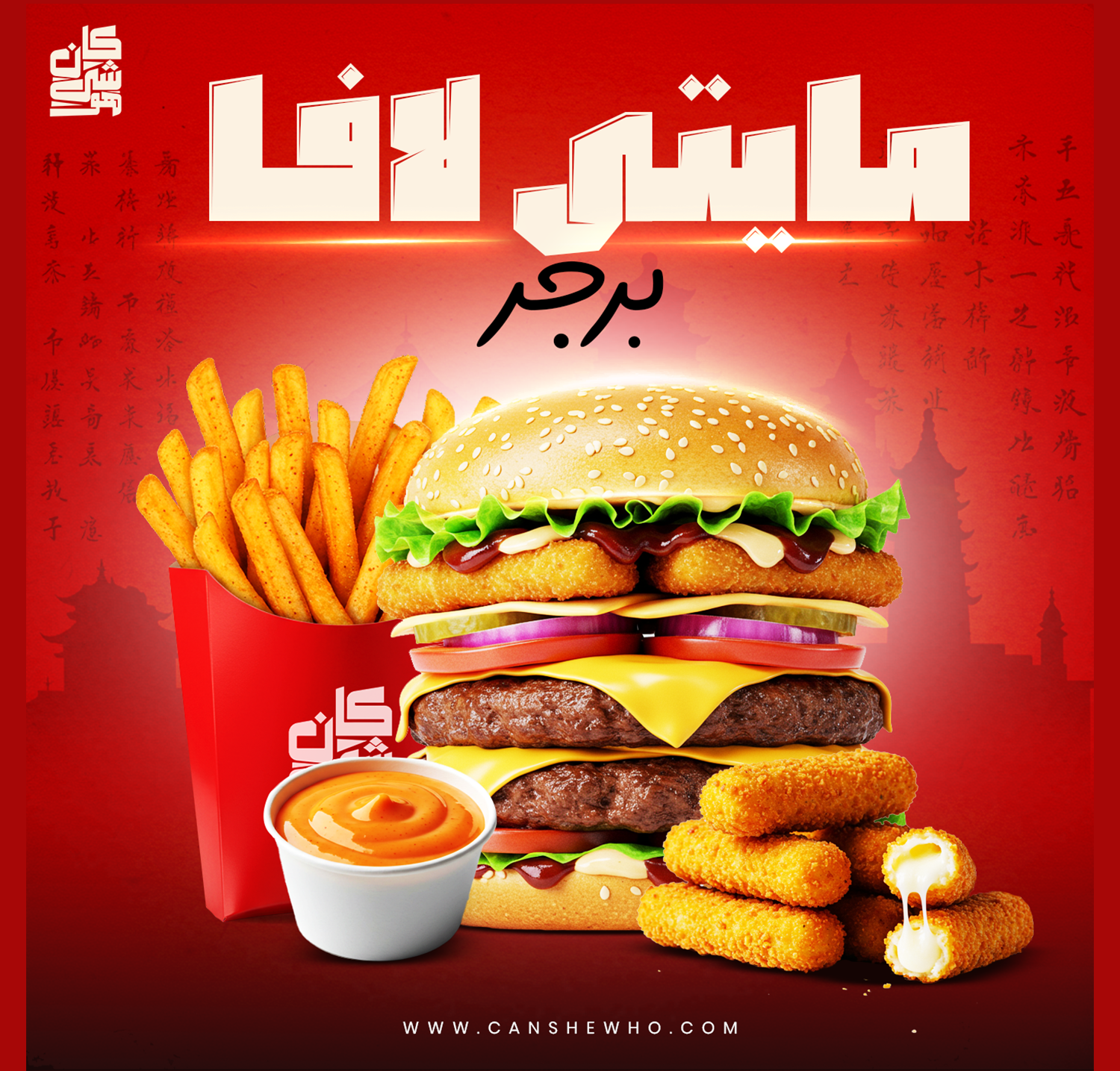


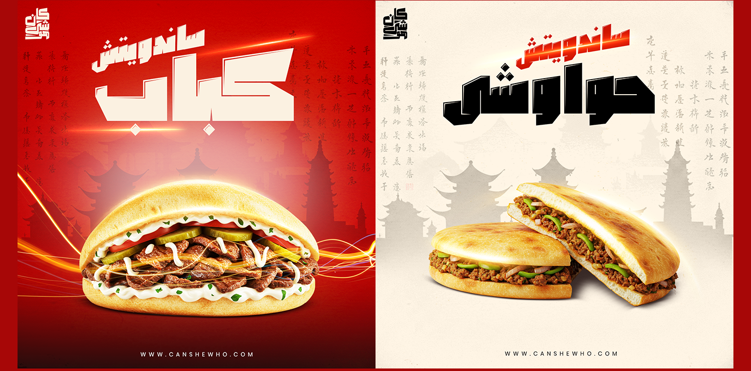
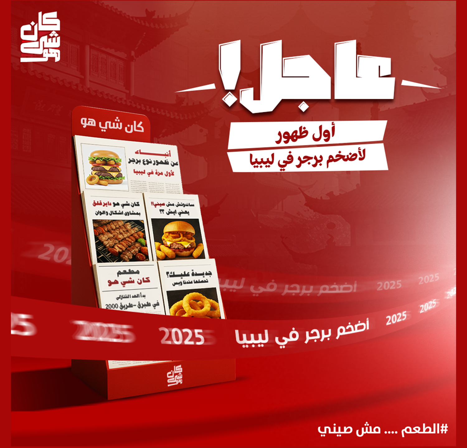
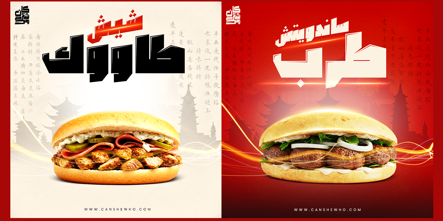
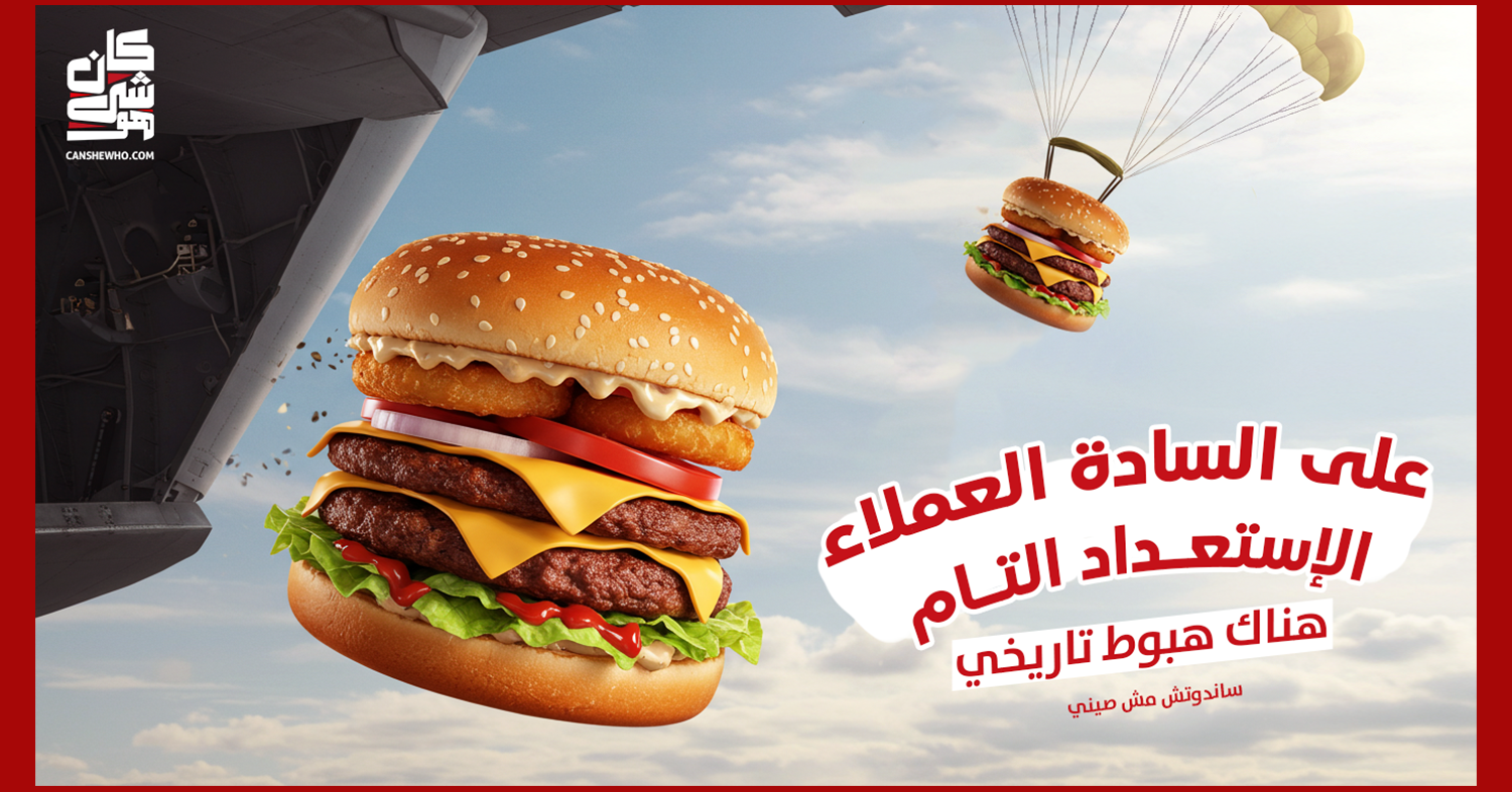

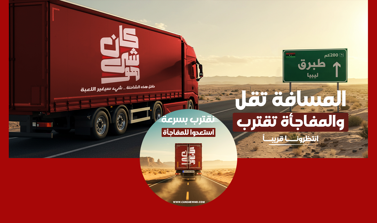

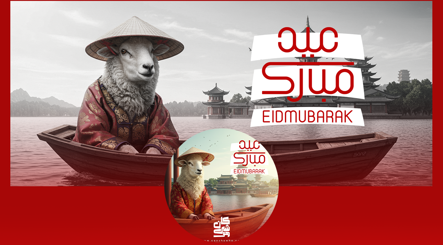

This project features a collection of social media designs created for Kan Shi Ho, a new restaurant specializing in burgers, sandwiches, and onion rings. Although the menu doesn’t include Chinese cuisine, the restaurant’s name is inspired by a Chinese-origin phrase, which inspired the use of visual elements such as Chinese patterns and cultural hints throughout the designs. This added a bold and memorable twist to the launch visuals. The red color was chosen as the core identity color, representing energy, appetite, and confidence — ideal for a fast food brand making a strong first impression. The project includes: Teasing posts for pre-launch engagement Main product showcases (burgers, sandwiches, onion rings) A unique mix of Eastern-inspired visuals with Western-style fast food presentation The goal was to create eye-catching, scroll-stopping visuals for social media platforms, aligning with the tone of the brand’s launch campaign.